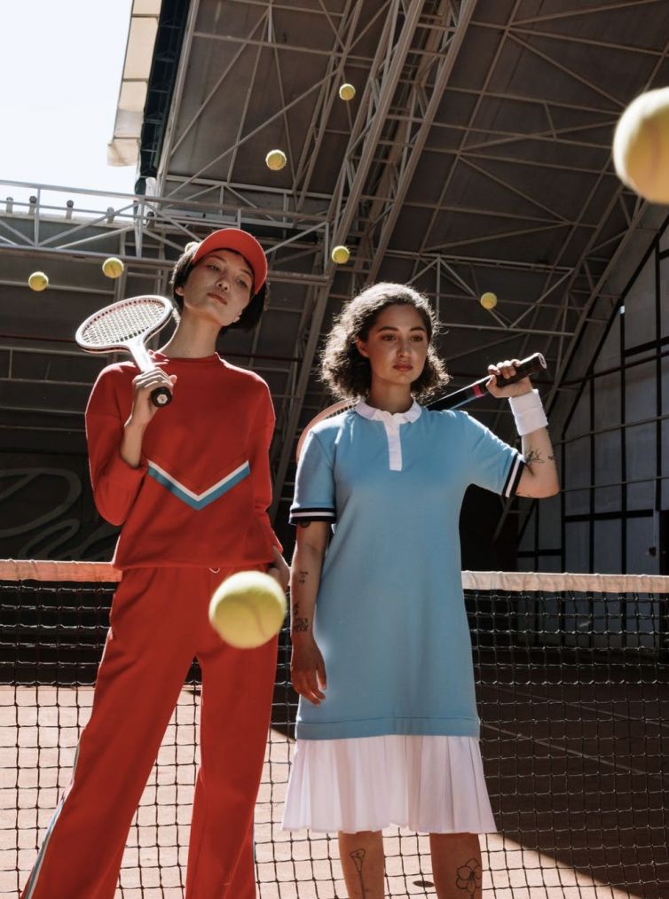
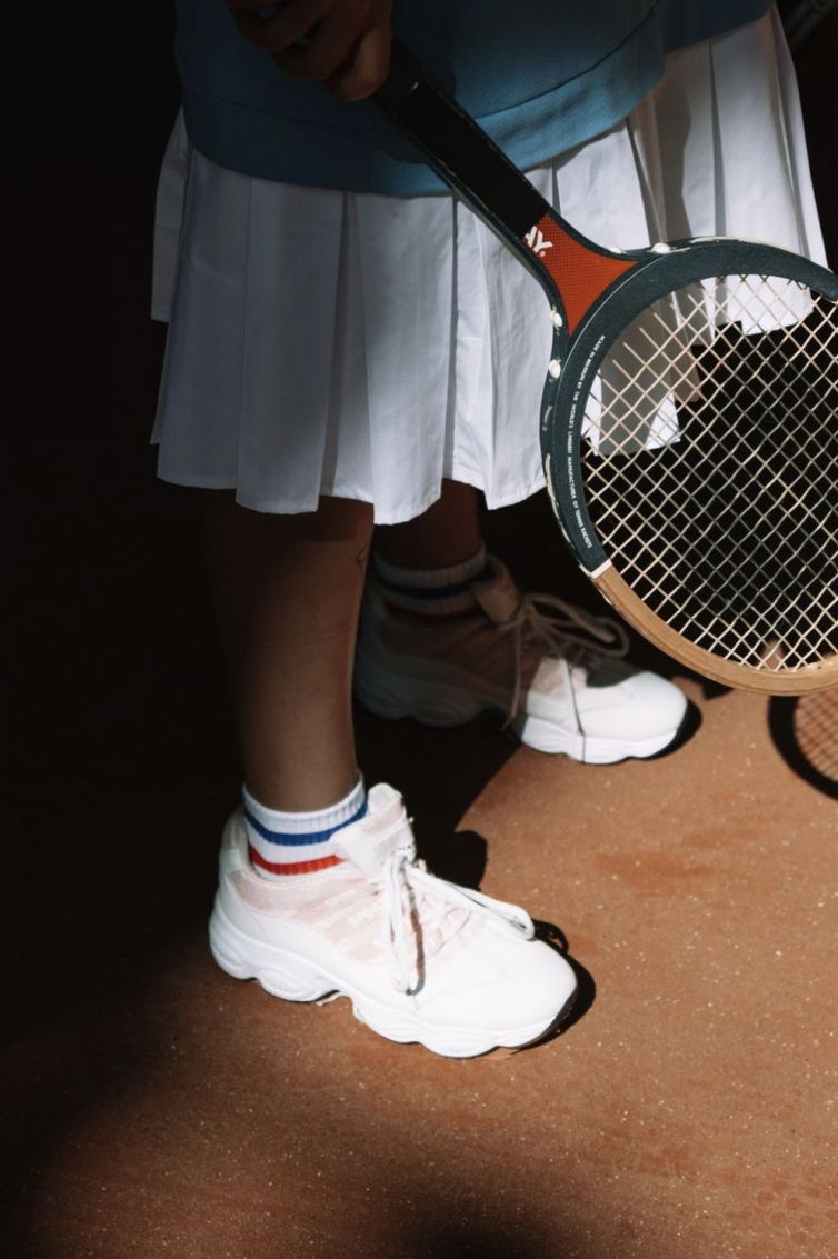
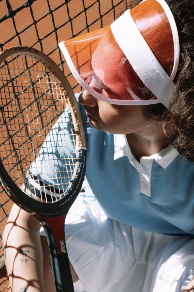
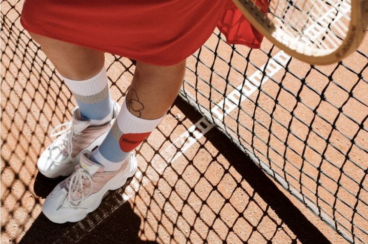
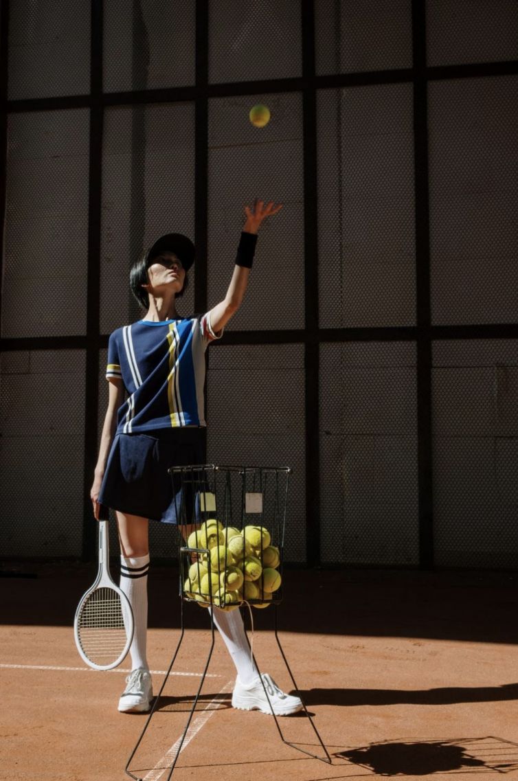
A good picture sells a product Even the most extensive and accurate product descriptions do not appeal to the buyer as good photography. This should not come as a surprise, as eighty percent of information reaches us through our eyesight.
Very often, we make purchasing decisions based on the visual impression. Blurred photos or the inability to see the details of the product can discourage you from buying, because they create the impression that the offer is not taken care of. So how do you take care of good product photos? When preparing an online store’s product offer, we usually have a choice of 3 options: we can use photos taken by the manufacturer, commission a professional external company to take the photo, take photos by yourself. In the first case, photos are usually taken by a professional and should be of good quality. However, if we offer products from different manufacturers on one page, it will be difficult for us to achieve a consistent style. It may also happen that some photos will be taken vertically, others horizontally, some will be typical product, and others situational. When displayed together, they will give the impression of chaos. Buyers very often like to see an item from several sides, check the color versions or look at the details. It’s best to take care of this type of photos yourself.
Own product photos Regardless of whether we outsource the photography to an external company or do it ourselves, there are several aspects that should be considered in advance. A good photo of the product, called a packshot, must accurately reflect the nature of the item so that the buyer has the impression that he is watching the product live. Here are some product photo tips: Choose a consistent style for the entire photo category (vertical or horizontal, product or lifestyle, etc.) Take care of good lighting. Take photos during the day or with the use of additional lighting. Think about the frames. Unnecessary objects or the photographer’s reflections in mirrored surfaces distract from the product. Fabrics, furniture and accessories can emphasize the beauty of even boring and unattractive items. Bedding on a bed in a nicely arranged room looks much better than folded into cubes. If you’re taking a photo of the product itself, it’s best to use a neutral white or gray background. Your product doesn’t need to be centered in the composition. Our gaze automatically shifts slightly to the sides. Read about the rule of thirds. The photo must be sharp and show the texture of the object. It should also not have reflections of light. When the session is complete, review all the photos on the big screen and if something went wrong, repeat the session.


